Brand Logos Redesign
24th April 2019 |

10 BRAND LOGOS REDESIGN
1. VIRGIN ATLANTIC LOGO
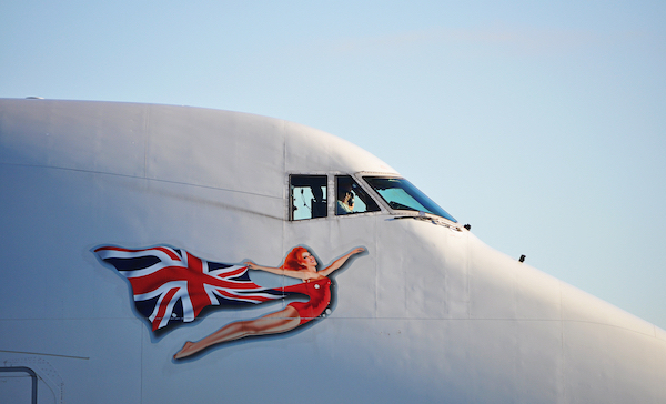
Virgin Atlantic Changes Up White ‘Flying Lady’ Logo To Embrace Diversity.
British airline Virgin Atlantic is letting go of its longstanding logo, the ‘Flying Lady’ from the 1930s, and bringing in five new versions to represent the diversity of its customers and workers.
The new logos include an LGBTQ character, a redhead, a Black man, a Black woman and an Asian woman. They are created after a series of other changes to increase inclusivity, such as employing the same number of male and female leaders, and a 12-percent representation of minority ethnic groups across the country by the year 2022.
As detailed by Nikki Humphrey—SVP of People at Virgin Atlantic—in a statement via CNN, the new icons will hopefully encourage people of all walks of life to “feel at home” flying and working with the airline.
2. STAPLES
Staples had its audience on the edge of their seats with a grand show of lights and transitions, only to reveal the very definition of a make-under: an emblem of a single staple and a sans-serif wordmark. At the end of the presentation, the company’s employees were seen walking on stage to applaud the logo redesign.
While many might appreciate the understated appeal of the logo, others have poked fun at Staples’ overwhelming demonstration.
“That… that was it?” probes Twitter user Eoin Sheehy.
“I feel like I could staple, like, 50 docs right now,” remarks Alex Konrad, associate editor at Forbes.
Hats off to Staples and its branding team for bringing a smile to everyone’s faces, nonetheless. It’s important to note that designers dedicated a considerable amount of time and thought into bringing Staples’ vision to life, so they should be recognized for their efforts as well.
3. MAILCHIMPP
One of the splashiest rebrands of the year came from the marketing platform Mailchimp. The new logo gives the company’s mascot, Freddie, a permanent spot in the design and changed from a script typeface to a blocky, cartoon style in lowercase letters (note the no-longer-capitalized “C”). The brand also adopted a cheerful new color: Cavendish Yellow.
4. UBER
The controversial ride-sharing app revamped its logo with help from design firm Wolff Olins. The logo is a case study in simplicity — a sans-serif wordmark that looks clear and confident in black-on-white and vice versa. Instead of choosing a monogram or symbol for the app icon, the full logo carries over to phone screens. Readability for the win!
5. CHICAGO SUN-TIMES
The Chicago Sun-Times revealed a new identity in March, working with Ogilvy on the massive redesign project, and positioning itself as “the hardest working paper in America.”
The new logo features a cleaner sans-serif font, with “Chicago” getting the same visual treatment as the rest of the name. It also brings a stronger identity with the red star symbol, as seen on the Chicago flag.
6. THIS AMERICAN LIFE
Podcast pioneer This American Life introduced a new logo in January, adding a symbol: a line-drawn American flag in the shape of a speech bubble.
It also dropped its chopped-up text in favor of a more digestible wordmark, and simplified the look by using only two colors (red and white) instead of three.
7. AD AGE
Ad Age made the long-overdue step of officially shortening its name at the end of 2017 to match how everyone refers to the well-known industry publication.
The new logo borrows from the brand’s 1930s logo, which featured a similar typeface with a standout “g.”
8. RE/MAX
Global real estate giant RE/MAX made the wise move of removing clutter from a busy logo. In the earlier version, letters randomly overlapped and made the wordmark less readable. Now, the wordmark features wide spacing and light cropping around the letters “E” and “M.”
The important lesson here? Choose one or two things to emphasize. The bright color scheme already grabs attention, so complicated lettering is just overkill.
9. DROPBOX
Dropbox wants to be a core element of creative workflows, not just a place to store stuff. That’s why the company transformed its literal box icon into an abstract design. The end result is a clean, flat logo that still gets the brand message across. The simple blue prisms are easy to print, and you still know you’re looking at an open box.
10. Formula 1 Racing
Like many veteran brands, the Formula One Group had to retire a logo that clashed with digital media. The 23-year-old logo showed an excellent use of movement and white space, and fans aren’t happy about losing it.
Fortunately, the new mark has its merits and is likely to grow on people. The stylized “F” resembles a racetrack, and the sleek, simple design mirrors the iconic sport.
Sources:
- https://designtaxi.com/news/404152/Virgin-Atlantic-Changes-Up-White-Flying-Lady-Logo-To-Embrace-Diversity/
- https://logojoy.com/blog/media-company-logos/
- https://www.freelogoservices.com/blog/2018/03/22/15-of-the-most-notable-logo-redesigns-of-2017/
- (Image via Edith Rum / Shutterstock.com)


