What is the difference between brand strategy & marketing strategy?
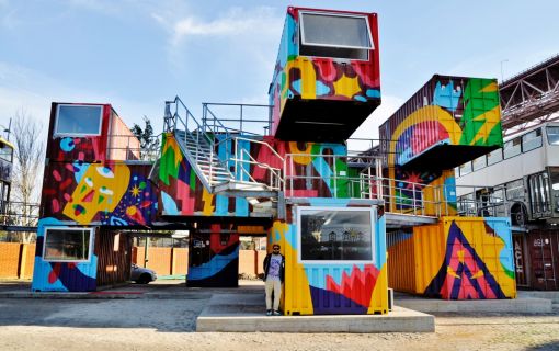
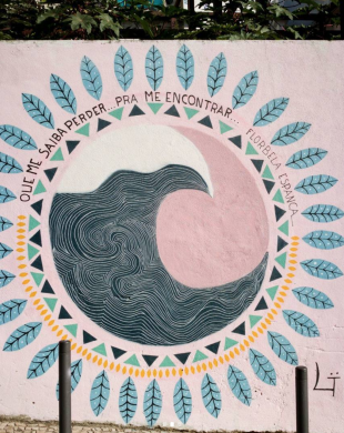
Recently Lisbon has become one of the capitals of street art. Portugal has a great number of very talented street artist...
Street Art is booming all over the world and Lisbon is becoming one of the Street Art Capitals.. The first time Portuga...
Have you ever bought a pair of shoes that you wore down to practically nothing because they fit so well?
Virtually every potential client will do an online search first before they ever even contact a business.